Friday, October 12, 2012

//Townhouse Accessorization// Touching Up the Dining Room with Colors

The dining room is my favorite part in this townhouse right now.  The awning window brings in so much light, and although it's a rather busy street out there, thanks to the thick cherry blossom trees, we are separated from the hustle and bustle just enough.

Before we got this townhouse, I walked by here quite often, and was amazed by the luscious cherry blossoms this past spring. Little did I know, a few months later I would be living in one of these structures generously surrounded by the beautiful trees. Once again I am so grateful to be able to live here, and really appreciate all the wonders nature brings to us.


I wanted to add an artwork to our dining room wall, and hence spent quite some time browsing for inspirations. Basically I know that I want something geometric, bold and abstract, but didn't have a concrete plan. Then I came across this image one day, and knew right away this was what I would paint! Simple yet powerful, the image leaves room for imagination. Perfect!

Transferring the image from the screen onto the canvas wasn't rocket science, although in order to get the right size and proportion, I did have to redo it.


After I had the composition laid out, the rest of the project was almost pure mechanical. Simply use painter's tape to block the same colored areas, color with acrylic paint, let dry and move on to the next. However as the image had some rather sharp corners, trimming the tape to fit these fine edges required the most work. Also, the reds had a far less coverage than the blues, so I had to work the red areas several times to achieve the desired coverage. The blues were so simple! One coat of paint and voila! So neat and saturated. Wonder if this difference is an acrylic paint thing or a cheap paint thing? :P


The left image shows an almost-done painting. The paint did bleed through the painter's tape a little, so I had to do a little touch up of white paint along the outer edges of the colored part.

The finished painting does produce a feeling of dimension and depth, I'm quite happy with the result. Big thanks to the master minds in cyber space that are willing to shaire their genius!


After the painting was hung on the wall, I found that it did match the dining room rather well. When I picked the dining room furniture, I was very conservative and stayed with subtle colors, as I was afraid that anything too bold or colorful may go out of style our I may get tired of it soon. However, I wanted to be a bit more risky with the accessories, since they are smaller and of course less pricy.

Our all-IKEA dining room started out all calm and neutral, and now with the bursts of colors suddenly there's a lot more life to the space. And since the painting has the red&blue tone, I extended it with a brighter twist by adding the magenta seat cushions and turqoise place mats.

The dining room faces south, so whenever it's sunny there's direct sun light in the room. Having these warm rays right in the house is one of the biggest factors that drew me into this place. The hues of the room is quite dramatically different with or without sunlight. Although here on the West Coast we can't ask for too much sun besides the summer, it's just wonderful to be able to expect the brightness in the room whenever it is sunny. The natural light brings me so much joy.


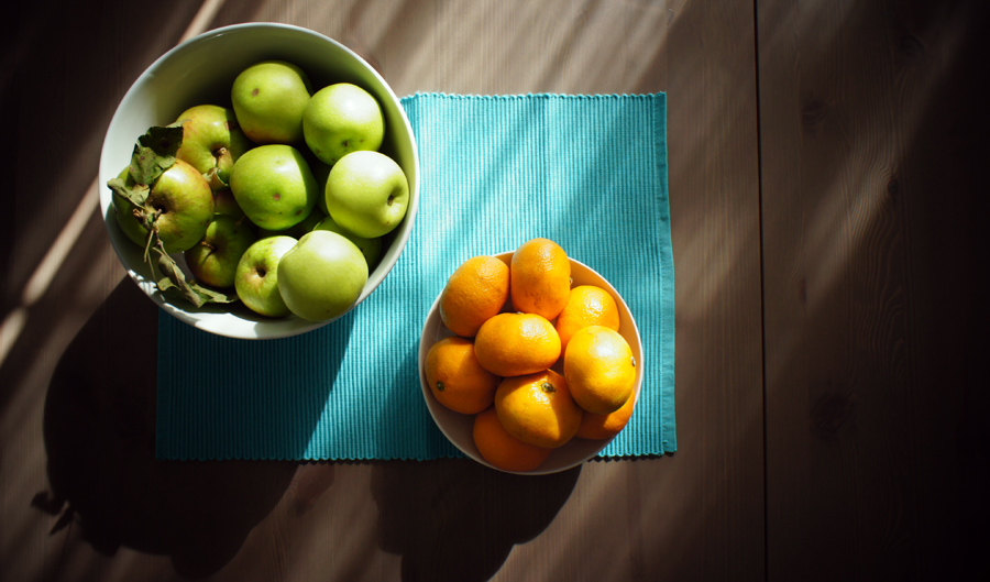
The day before I took the photos, I stopped by my previous rented residence and said hi to the nice Germany old lady who lived next door. She was so kind to us all last year, and that day she asked me to pick the apples from the tree in the front yard. She said that a black bear was getting into them and both her and the new tenants in my previous home spotted the bear. Although sighting a bear sounded pretty cool, I thought staying safe may just be cooler. I was very content with our little harvest.

As the last bit of autumn sunlight hit the colorful dining table, I feel ready to add more colors into our home.

Thursday, October 11, 2012

//Handmade// Simple Wall Decor with Elements from Nature

Having a home that I can decorate from scratch has always been one of my dreams. I have been fortunate enough to have a place to live and acquired a lot of hand-me-down furniture for the past 10 years of my married life. While it's great not having to spend a fortune on the house and home funishings, our previous home just lacked a sense of style and looked like pieces thrown in together to make the place liveable.

At our new home in North Vancouver, I am able to start fresh. Yes this means digging into our savings but the process of piecing everything together for this townhouse has been quite an amazing ride too.

For this post I would like to share an artwork that is so simple yet has such an impact, brings life to an otherwise very plain wall. 


I found this via pinterest, and knew right away that this was something I will make. The original source was in Russian, but I think the pictures pretty much explained everything. I started with 4 blank canvases, hung them on the wall first to see how I will organize the colors and lay out my objects.

Besides the canvases, I also needed some paint, a bottle of spray paint (I used gold as in the source) and some found leaves/sticks/flowers.


I prepped the canvases with acrylic paint. It's been a long time after art school that I messed around with actual paint, let alone a piece of canvas. (I was in communication design so pretty much had my nose glued to the computer after freshman year) I used the cheap paint from Michaels and it worked fine. One thing I discovered was that the hues from the red color family do not have the same saturation/coverage as the cold colors, so for instance the magenta needed more coats and more colors mixed in to have the canvas covered completely, whereas the blues only needed a simple coat. My favorite mix was the grass green color, as when I saw that the essentially rather pretty grass green out of the tube had very weak coverage, I mixed in a bunch of different greens/blue/yellow to make it work. Gotta thank my color theory teacher!


Then there was the fun part of collecting leaves/ferns/flowers for the actual composition. This is the one part of the project where and 'artistic eye' was needed, and also having to keep in mind to find objects that had an interesting enough shape as well as a flat enough surface so when it got spray painted the silhouette would be clear enough. Speaking of spray paint, which many home craft makers are masters at, it was almost a bit intimidating as I have nevery really used it before.

The distance of the spray paint can to the canvas was the key. If sprayed it too close the fragile leaves would be blown away from the canvas, but if sprayed too far then it's very hard to saturate the canvas with spray paint.

I failed my grass green canvas, twice, actually, as the first time I picked an obejet that didn't have enough of a flat surface so the shape couldn't show, and the second time I held the paint too close to the canvas and messed up the composition. Talk about learning from mistakes!


The finised products, however, was fairly satisfactory. The metellic paint reflects the abundant light coming from the big bedroom window, and add a bit of lux to our room.


The dandellion piece is my favorite one. The stems were so fine that I was really afraid that they won't show after I spray-painted them, but to my delight it showed just enough so I could see its shape, yet the fuzziness around the edges adds dimension and depth. And the same thing happened with the pine branch too.

The fern turned out nicely too, and my third attempt on the green one finally had an acceptable appearance.


Now, with all the lovely pieces in place, (yes, loving my lamp and waiting-a-photo-to-be-chosen-to-put-in picture frame acquired from Home Sense) I finally have a bedroom that I feel like spending time in.

Huge thumbs up to the craft makers out there bringing so much inspiration and ideas to me!